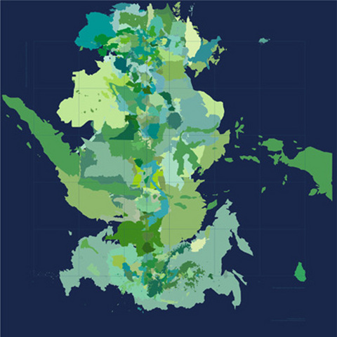
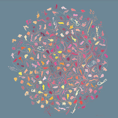
Governing Values (Labour Force), 2004 digital prints 1000 x 1000mm
The countries of the world split asunder from their continents and aligned along two axes, their new position determined not by geomorphology and plate tectonics, but by national characteristics ranging from adult economic activity or health expenditure, to inflation rate or land use. Thus the world as we know it flies apart, different regions explode and scatter like confetti across the deep sea-blue background, or those alike huddle together in a corner, leaving the exceptions in the middle of some new kind of nowhere.
Landscapes (Birds), 2004 digital prints 20 x 80cm
Sure, Louisa Bufardeci’s works are types of maps, but they plot physical features such as physical outline (the discrete shape of a country) according to non-physical attributes, rendering a new hybrid geography which combines geological, political, social, cultural and environmental aspects.
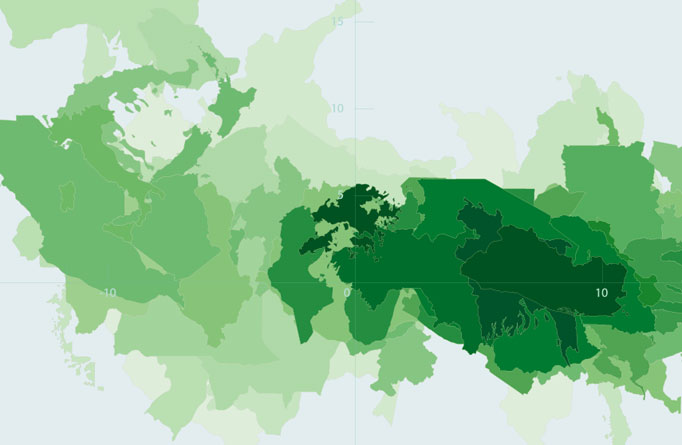
Using charts, tables, maps, and various databases and software, Bufardeci generates a new multidimensional space that barely resembles the world we are used to, the world most often put to us by Governments, or businesses, or religions. She is one of an active group of radical cartographers looking for the right shape of the world, a more accurate data-set to describes our global condition.
To start, no traditional flat map truly resembles the world, because there is no way to represent a curved surface on a plane, no way for the globe to be flattened and squared. None of the 15-20 maps currently used are accurate. Curiously, this has only been a public issue since the 70s and peak geographical organizations in the US signed a manifesto as recently as 1989 rejecting all rectangular maps as a distorted and misleading view of the world.
Mercator was the problem in 1569 designing a navigational map, which subsequently became the predominant view of the world. While Mercator’s projection enables a true bearing to be taken, and a course to be plotted, it distorts terrain north and south of the equator as a result, making Europe and America appear larger than many of the ‘colonies’ that were ‘discovered’ using his maps (which might explain the ‘post-colonial’ issue with Mercator in the 70s).
Even using a sphere, which might more accurately represent the scale and relative location of countries, certain features are rescaled to be legible and provide information, while others deigned to be of less consequence are left out. Some rivers marked would actually be invisible, complicated topography is simplified, most sacred sites never appear.
Maps embody the way we look at the world, which is different from the way somebody else might. To this end Bufardeci has constructed several to reflect a particular worldview, say that of the CIA, which looks at the world according to levels of corruption, stable government, conflict and economic prosperity. Square blocks of these different colours overrun national borders to form the real ‘blocs’ of concern for the United States. There are other maps for languages spoken or exports.

Export Distribution, 2003 digital print. 60 x 110cm
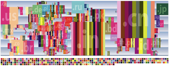
Languages, 2003 digital print. 110 x 290cm
But Bufardeci has also constructed her own maps based on more positive sentiments, such as the world map as a floorplan with all doors flung wide open in welcome – in proportion to immigration – as if the world was a big share house

Ground Plan, 2003 digital print 330 x 900 cm
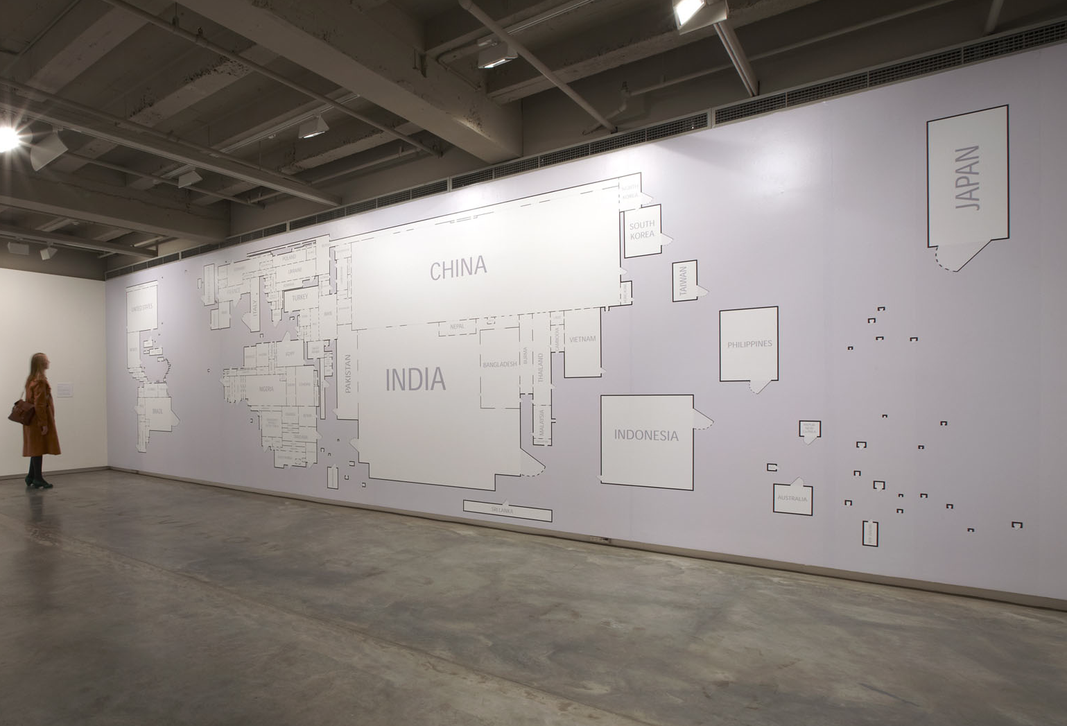
Ground Plan, 2003 installation at MCA 2009
Or her maps of proposed equal distribution (by population, literacy, gender, people living with AIDS, internet hosts, etc) where equal sized land masses are randomly, evenly and independently distributed across the globe, each with a fair share of problems and resources (arrows in-between illustrate the redistributions required to achieve balance), although rendered in various intensifying colours.
Recent Plans for the Equal Distribution of Equality (fertiliser), 2008 digital prints 900 x 900mm
Though they often seem unchangeable, maps are pictures after all, drawn by someone, expressing certain interests and preferences (or hopes), and they start out as an alternative, speculative view of the world. Cartography and art intersect at this moment but diverge as a map may occasionally achieve consensus.
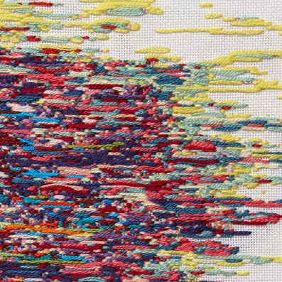
An artist is keenly aware of “how the way we represent things tells us so much about the things being represented” and Bufardeci has taken the same approach to more abstract things and ideas like numbers, time, data. She shows us how the manipulation and arrangement of facts can reflect their specious, directed collection.
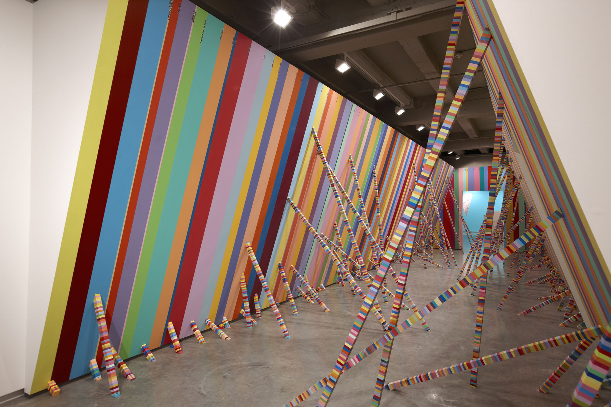
Her rendering of the Australian Federal Budget for 1999-2000 comprises a series of vivid vertical stripe-paintings for 14 categories of expense, where the colour, length and width of each stripe illustrate comparative expenditure. While ‘defence’ is a much grander work than ‘public order and safety’ (the government’s concern in outlying unrest is clear), the masterwork remains ‘social security and welfare’ at nearly 5.5m long, its vertical pulses and rhythms seem unending, from dark to light then dark again, a low, glowering cloud full of issues.

Tax Payer’s Money (Health), 2000-2002 acrylic paint on mdf 100 x 242cm
Census figures were used to paint-out a gallery in Sydney’s Museum of Contemporary Art in candy-coloured stripes representing birthplace, languages spoken at home and migration of Sydney residents. Bufardeci said of the work: “viewers will hopefully find themselves statistically and literally in it”.
Team Joy, 2004 mixed media installation Photograph: Jenni Carter
Likewise the coloured bars underfoot of laneway commuters in Melbourne’s central business district might reflect their collective characteristics by census numbers.
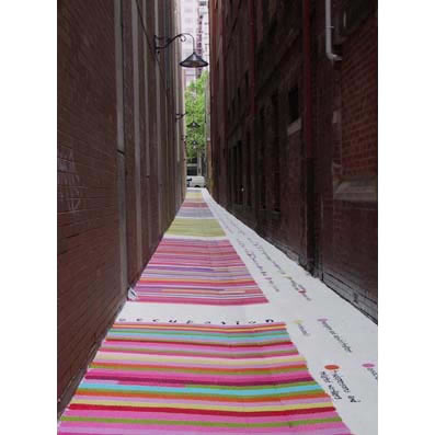
here are a few facts I think you ought to know…, 2001-2 City of Melbourne Temporary Laneway Project
But Bufardeci’s point is about gaps and imprecision, since no statistical framework will ever suffice to represent the complexity of real, living people standing in real space.
Cartographically-speaking, this is the ‘error of closure’, the gap between reality and the map of it, which can vary in size, but which characterizes all maps since by definition they are all approximations.
Indeed, Bufardeci herself recounts an awkward experience being polled by the Australian Bureau of Statistics on employment: “I didn’t fit into any of the categories on the questionnaire and was often asked to select the ‘nearest’ category, which for me was like asking which colour was closest to red: yellow or blue.”
So too the hard-edge abstraction in her work, which relies on the clear and rigid distinction between colours for its striking optical effect, is ultimately incapable of registering the complex meshing of individuals and fixed common attributes. Indeed, contrast in her work – as in cartography generally – simply compounds the illusion of things being separate.
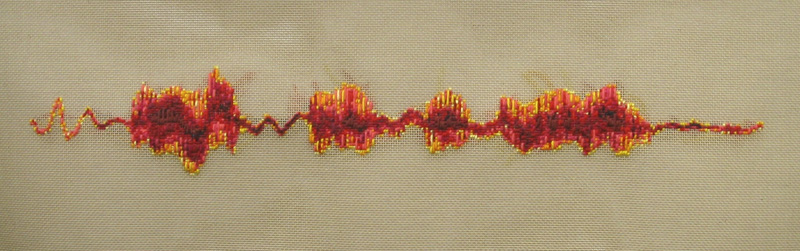
Which is the subject of later work where the impact of individual actions and statements on world events are considered in minutiae. Using sound recognition software, Bufardeci has broken down fragments of some these historical turning points into their constituent sound-waves, a second or two only of transcribed sound.
Thus the sound of the Browning 1910 handgun used by Gavrilo Princip to assassinate the Archduke Franz Ferdinand of Austria in Sarajevo in 1914, and bring about the first world war, compares to the hollow phrasing of an anti-Iraq-war protest speech delivered at a 2006 rally in Adelaide.
As if replaying these moments in extra HD slow motion, Bufardeci embroiders the wave patterns, bringing history almost to a stop, as if closer scrutiny afforded by her petit point reconstruction of events might reveal the import of these actions.
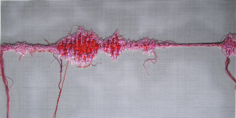
Every second is like, forever, and every year is like 11.3 centimetres, 2007 embroidery floss, fibreglqass screen, each 50cm wide,
“I sit and stitch and this action becomes an action of inaction, like all my other daily actions”, she says, “And they become actions of waiting where every second takes forever and every year is absurd”.
Anti-War Speeches (‘try someone else’), 2006 wool tapestries, each 16 x 60 cm
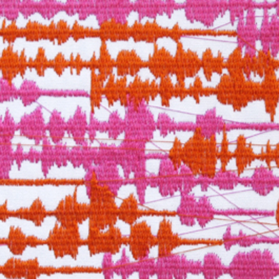
13 captured telephone conversations – all one minute long, 2006 machine embroideries, each 13 x 18 cm
Further, these sound waves are compared to various arbitrary recorded telephone conversations, as if the events of history – its distinctive patterns and rhythms – could suddenly irrupt from in-between the cadences of banal chit-chat; if only we’d cock an all-hearing ear we might hear the clues (indeed, the plans for 9-11 were communicated as preparations for a wedding).
Ultimately it’s hard to tell the various waves apart, and no doubt all history is rooted in the granular, incidental composition of daily life; from the pixels of cell-phone images from Abu Ghraib, or the stepped 9-point font of an email admitting BP’s responsibility. We can break things down to the basic facts, the most common attributes, go back to the beginning, to when we first heard what happened, when the sound reached our ears. We can consult the CIA Fact Book, the national census, the World Bank, UNESCO and opinion polls, but – contrary to Cicero’s plea Res ipsa loquitur – the facts rarely speak for themselves, but are made to speak for somebody. Indeed, not even ‘yes’ or ‘no’ are certain replies under scrutiny.
Yes and No, 2009 handstitched needlepoints, cotton on linen/viscose fabric, 800 x 800mm each
“Notions such as: the freedom of speech, equality, transparency of information, and the right to vote, twinkle and tempt me as noble ideas framing ignoble realities.” So Bufardeci sets facts against themselves – content versus form – to expose the tattered condition of these first principles of democracy. We are a long way from our ideals and her work measures that distance.
The latest work extends to representations of universal space-time, as if the continuities expressed through experimental physics include or envelop all other maps and images, and they might yet.
Bufardeci’s flags in four dimensions applies the theory of mutli-verses as a template for a series of origami like folds to render these typically simple, flat symbols into contorted, more complex – and ultimately more expressive – forms of national identity-in-flux around the world.
Flags for the Fourth Dimension, 2011 seersucker fabric, snaps, press studs dimensions variable
Similarly the Japanese craft of kumihomo is used to represent the tiniest influences of string theory, each knitted coloured ply an elaboration of the unseen forces supposed to keep shit together at a millionth of a billionth of a billionth of a billionth of a centimeter.

String Theories, 2012 cotton embroidery thread, each approximately 15 x 15 cm
Yet the world flies apart into fragments, rendered in its various dimensions by different maps, charts, diagrams and models, ranging from annual summaries, or global perspectives over decades, to the close analysis of split-second events, or the tiniest sub-atomic influences. But nonetheless there is a logic of history that Bufardeci’s work reveals; a kind of forlorn but incessant hope which springs eternal beneath our failures.
The minor strand of humanity, within the chaotic-seeming whole that her works describe, is ultimately defined by the species aggregation over time of what each of us chooses to do at any one moment. The moral remains: let’s choose wisely, as best we can.

(In a very short space of time through very short times of space) the universe devolves into a string, 2012 wall drawing dimensions variable
Louisa Bufardeci is represented by Anna Schwartz Gallery, Melbourne and Sydney
